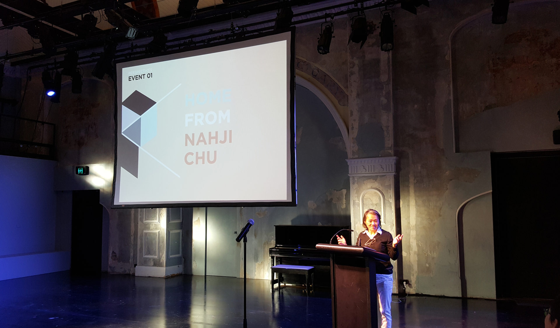
PERSPECTIVES BEGAN AS A RECOGNITION AND RESPECT FOR THE KNOWLEDGE AND PROCESSES OF OUR PEERS, WORKING WITHIN THE CREATIVE INDUSTRIES.
The Brief
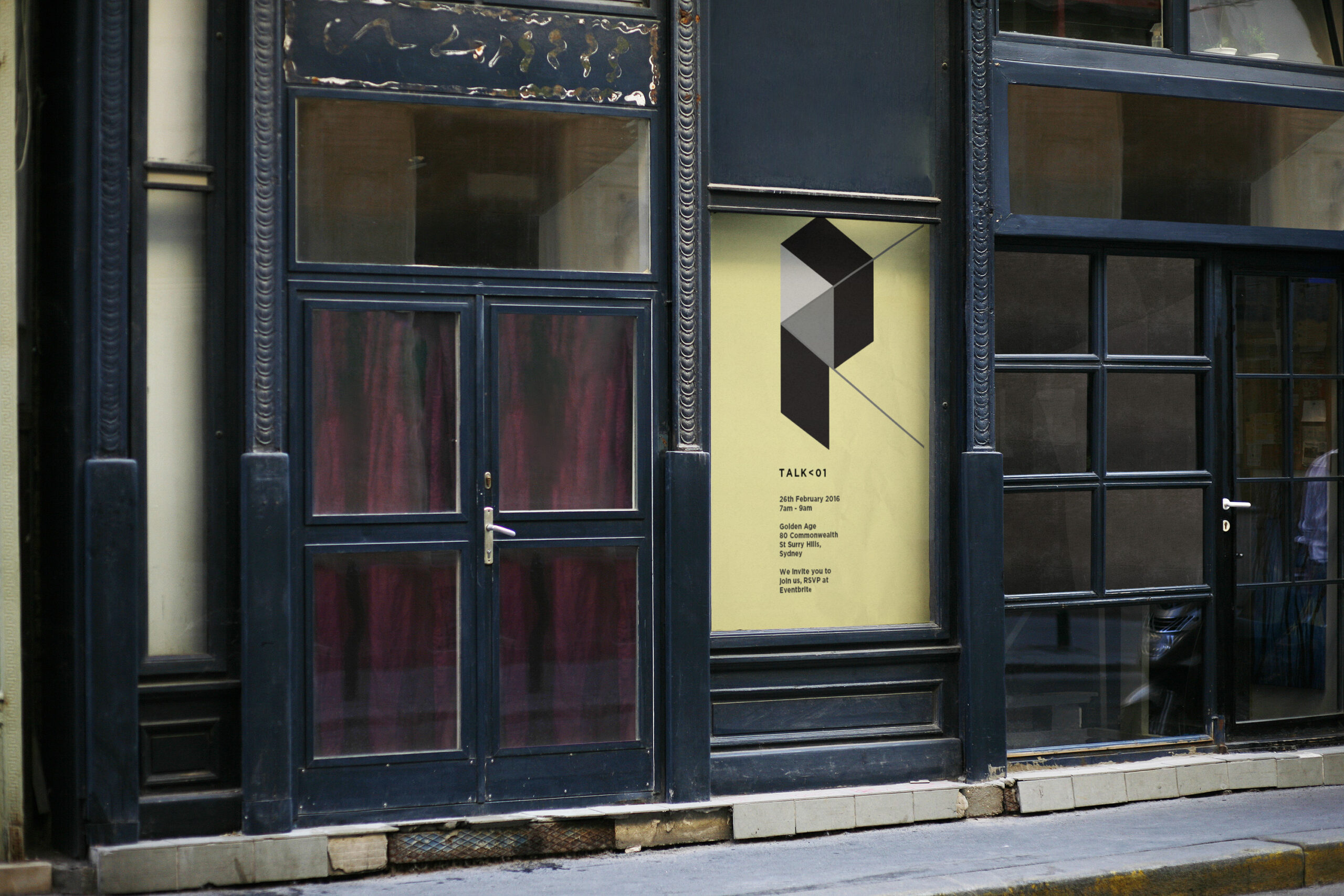
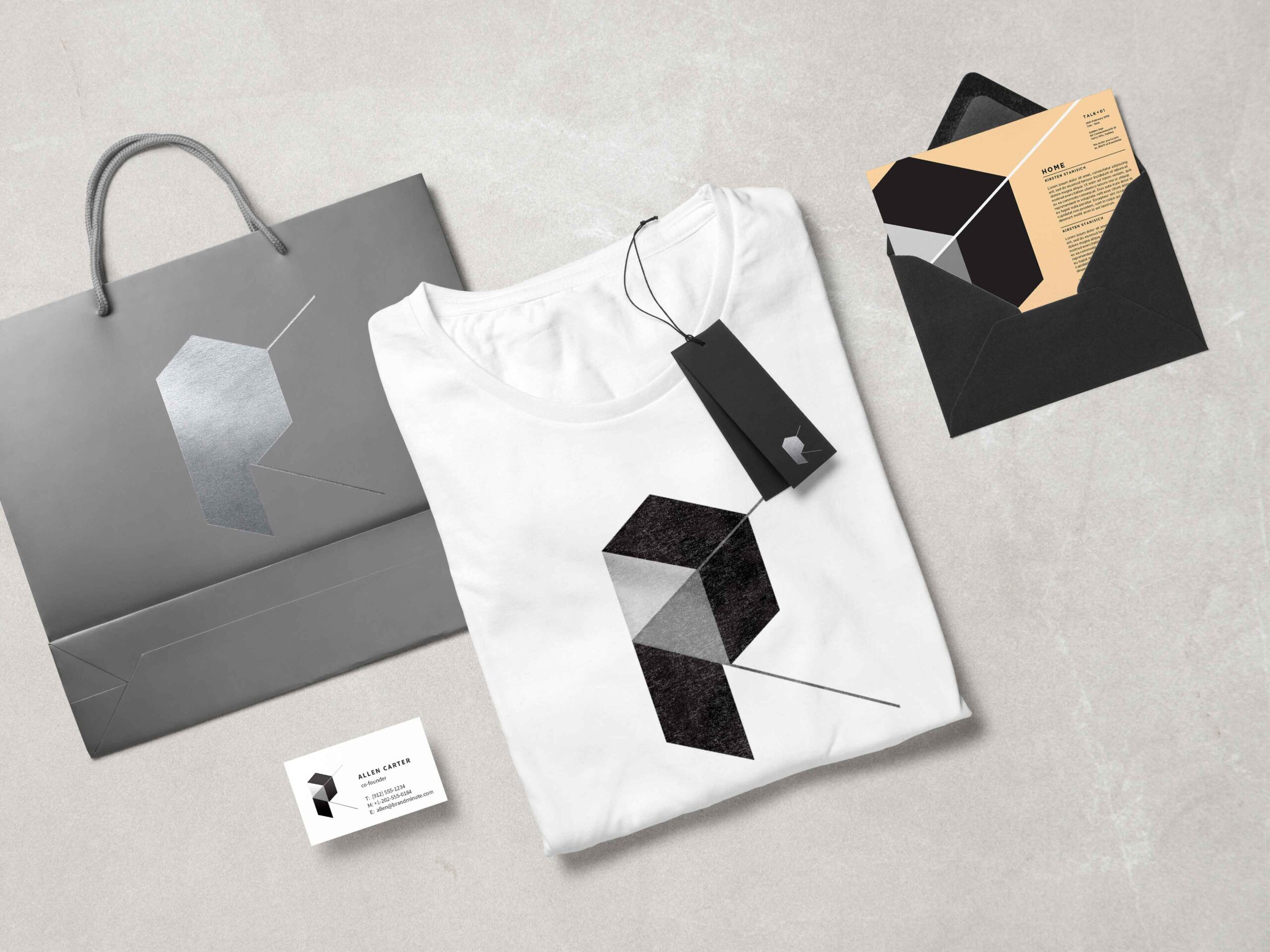
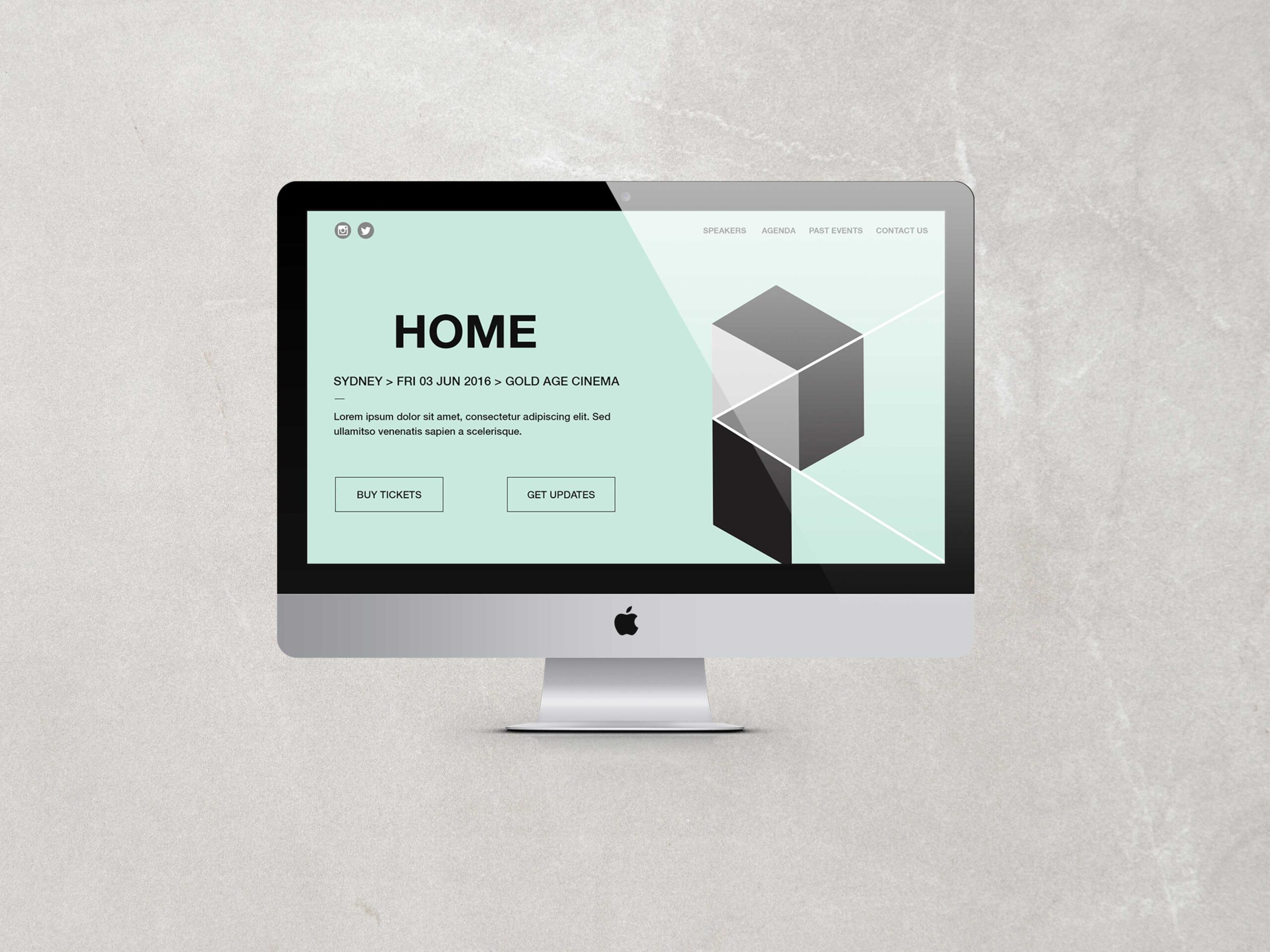
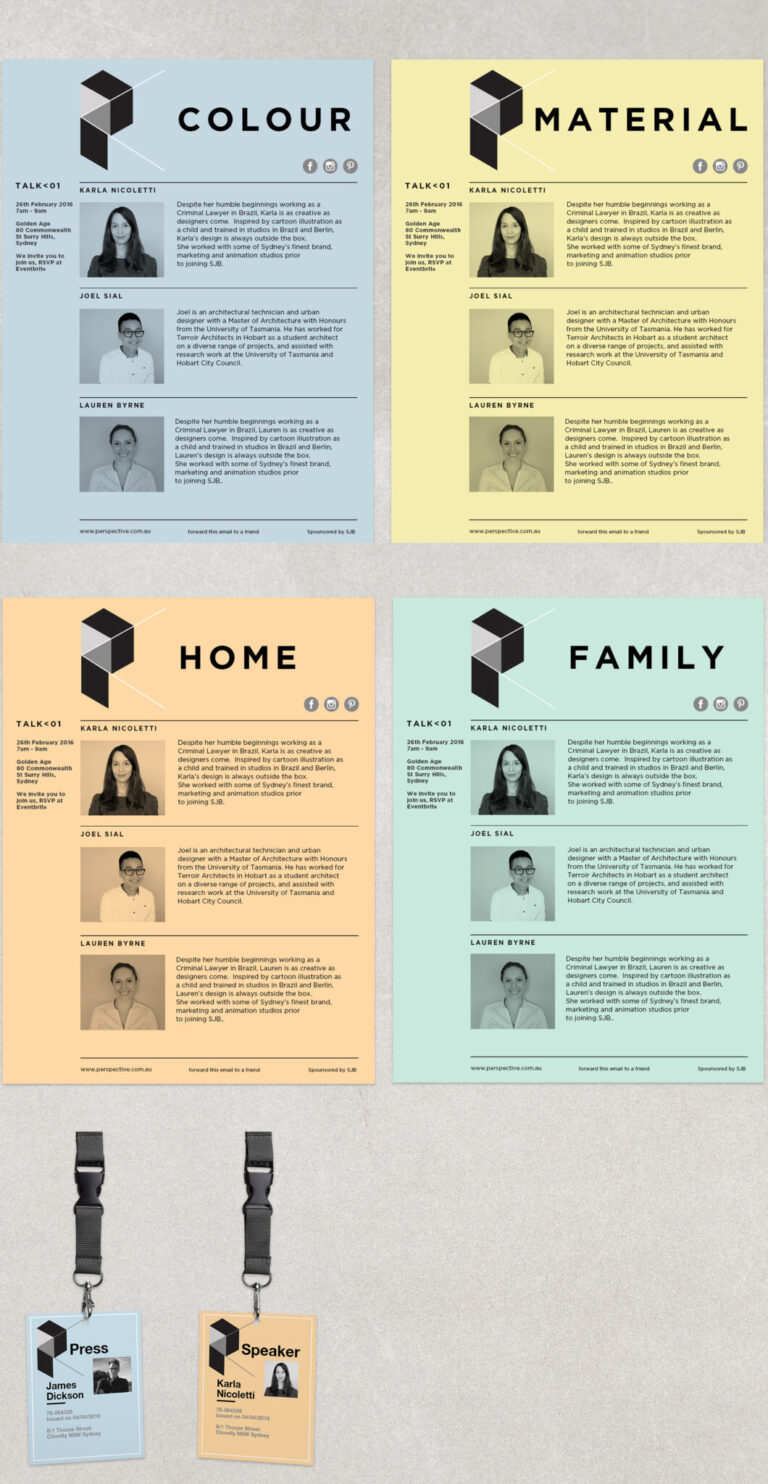
The design challenge for Perspectives was, how to engage and excite the young Australian creative community with inspirational female presenters, without being sucked into a ‘girly’ theme. Not just a brand identity, a full communications solution was required to launch and grow interest in the venture.
Solutions
Conceptual harsh lines and angles, pastel colours and simple bold layouts defined the idea. The design needed to be transferrable across print and digital.
Results
The big “P” is inspired by the visual illusion books we would read as children, showing that something can be viewed in one way, or another. The angled trajectory of the line also brings out the theme of divergence and convergence, depending which way you look at it. www.perspectives.net.au